Life.Ana
E-commerce
Branding
Life.Ana is a fictional B2C managed by a creative soul who turned her passion into a profession, and now delights customers with her unique and whimsical creations. They offer a wide range of functional home-decor products to spruce up every corner of your home, whether it is in the kitchen, bathroom or living room. Each collection is inspired by a specific theme, often drawn from nature's beauty.
Brief
A design concept for LIfe.Ana ecommerce website to showcase their curated collection of high-quality products. The goal is to look premium and organized, feel easy to navigate and shop from, to improve the user experience of their customers and make it as seamless as possible.
Strategy
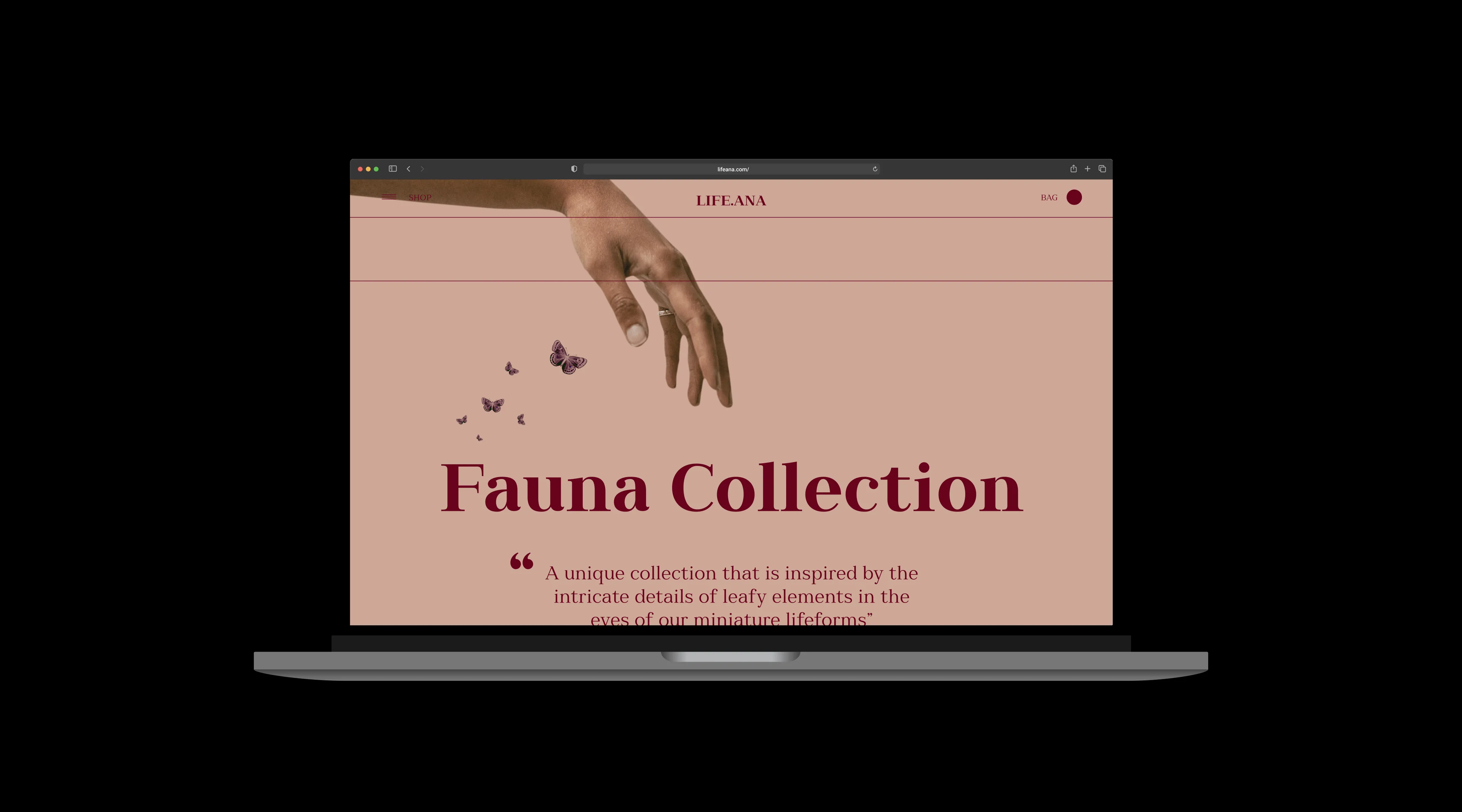
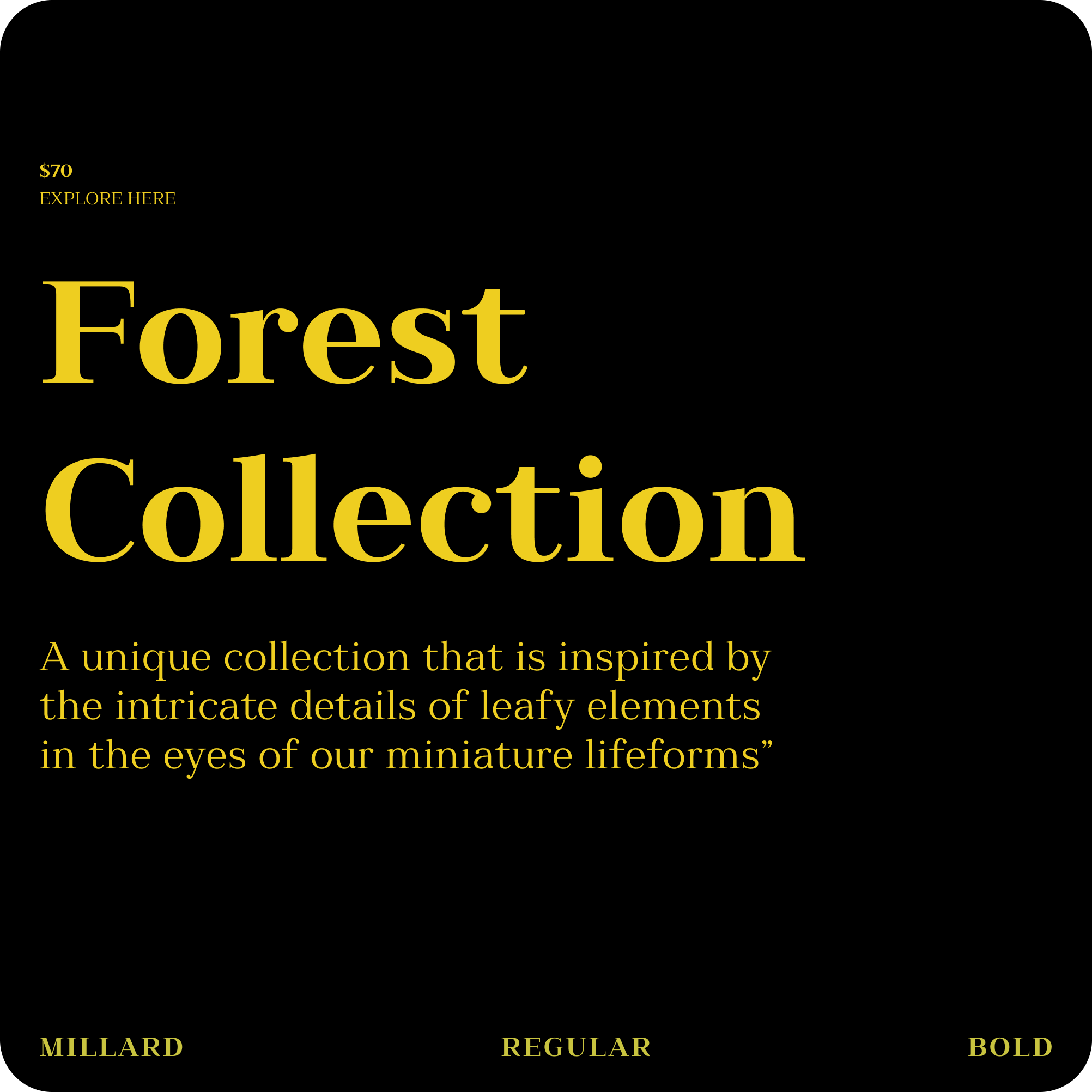
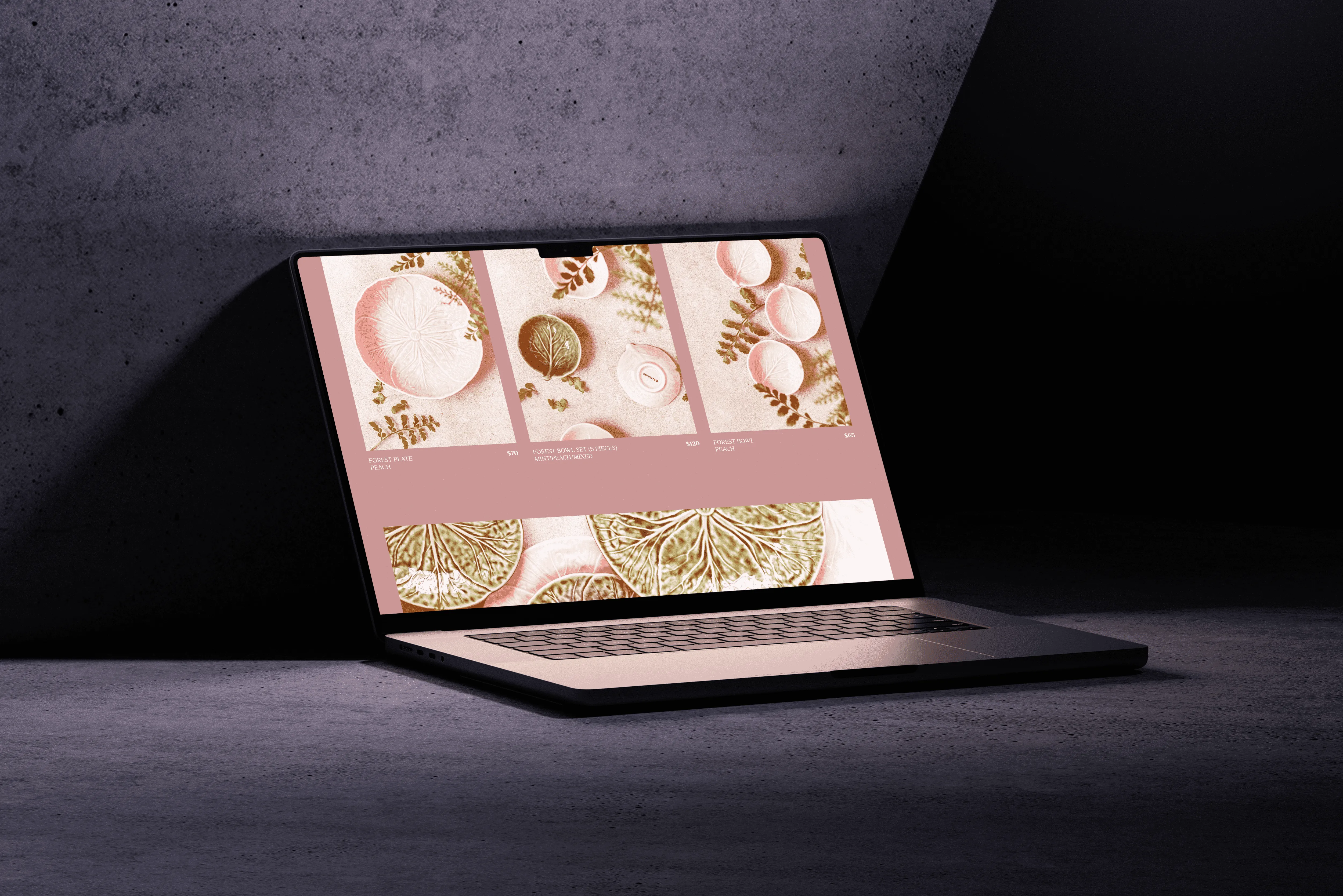
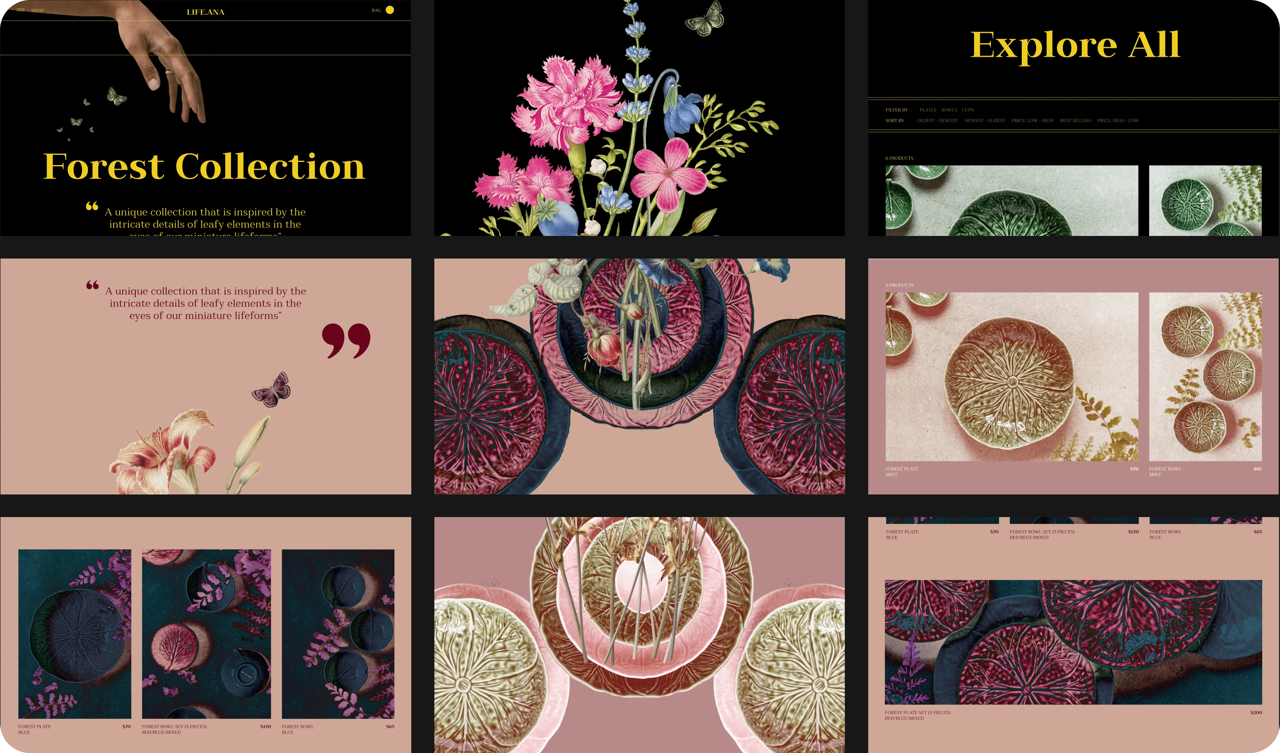
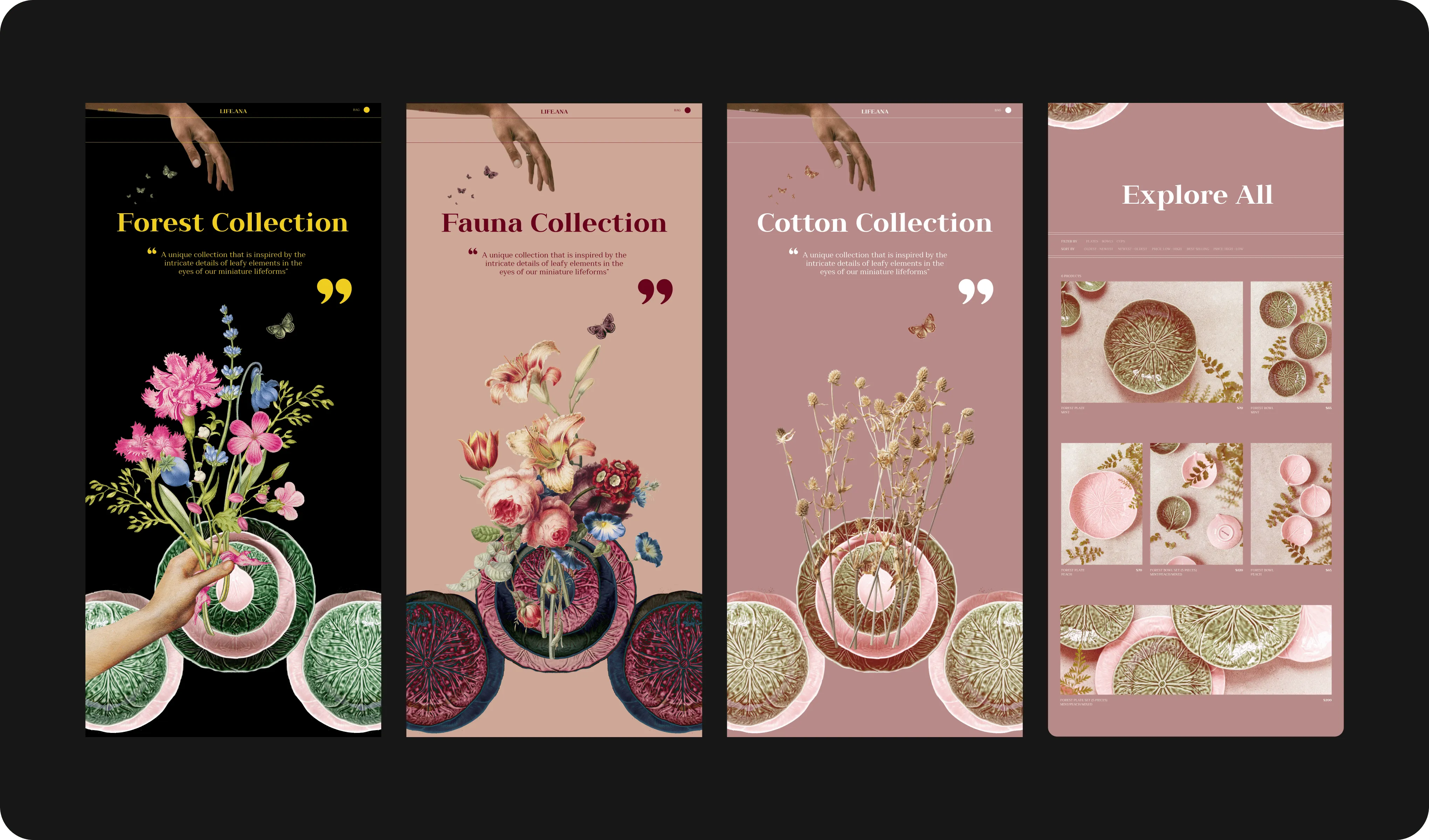
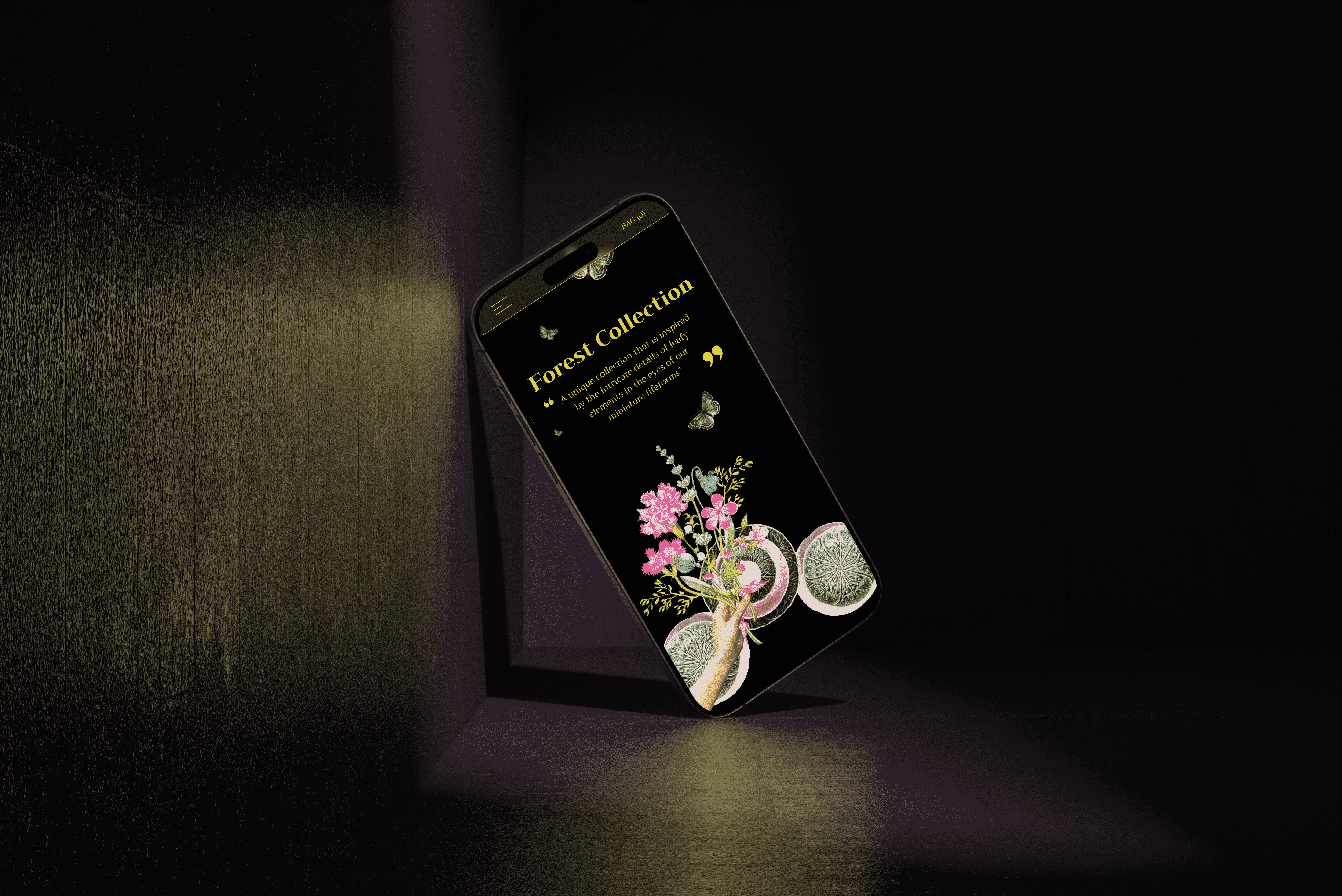
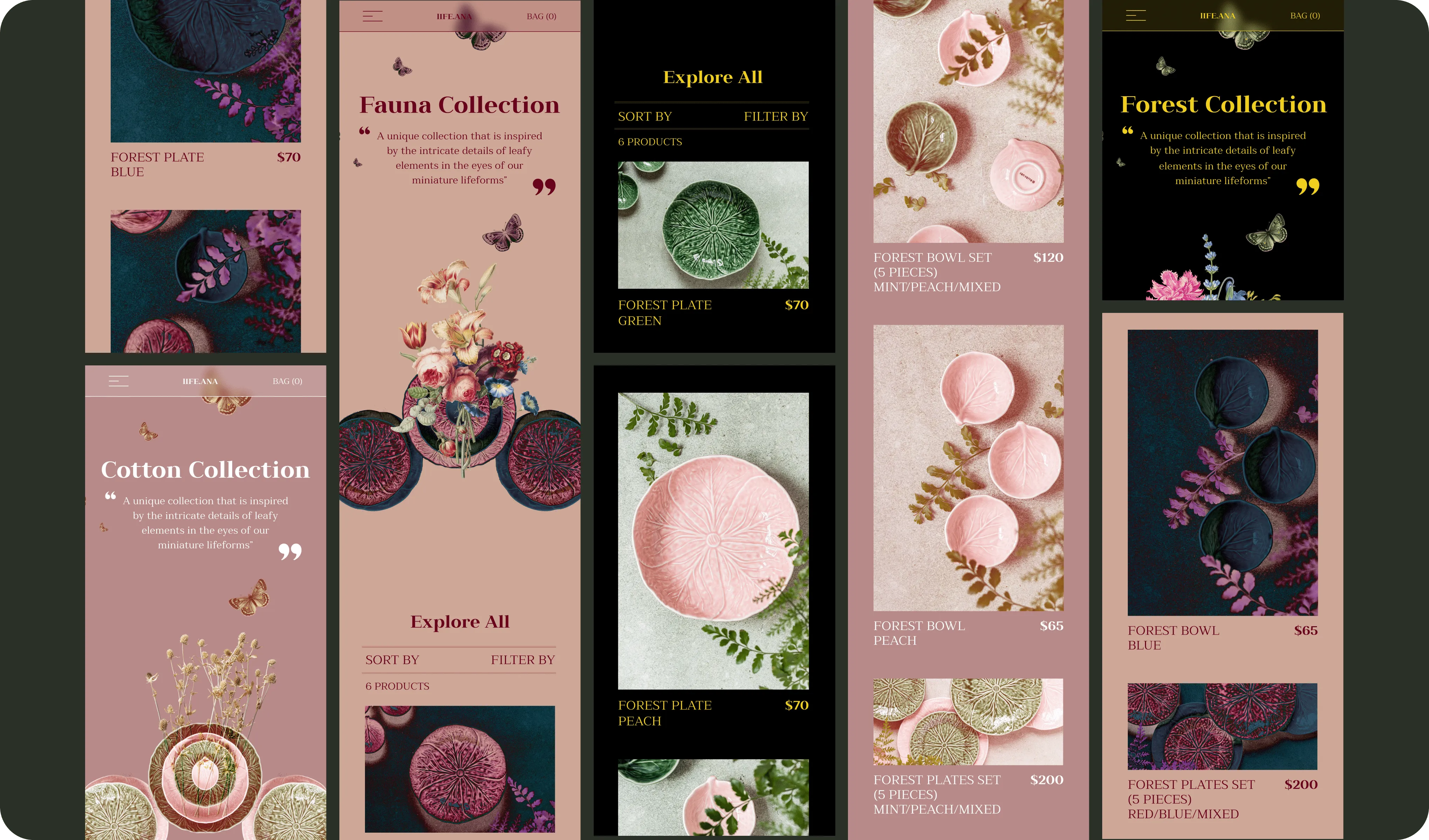
You can be easy to use, organized and still look great. Most choose one or the other, but not here. Both are just as important, the trick though is to prioritize what to show. And the answer to that is....show only what the customer wants to know at first glance. In this case, we combined all the products that fall under one collection theme and created a unique page for every one of them. Inside these unique pages, you can filter out the type of products you want. This user journey is also great for customers who look for consistency in their decor purchases. This design also goes the extra mile and helps increase sales by showing the customers all the other options they can add to their basket to ‘complete the look’. BINGO Every collection page is meant to showcase the personality and mood of the collection. You'll see stunning images, beautiful backgrounds, and charming color schemes that will make you feel like you're in the room, all meant to help the customers decide, if it is matching the vibe they are looking for. Life.Ana customer base really cares about getting the overall look right, so it is the website’s job to convey it and help them as much as it can, and make their decision making process both easier and faster.
Outcome
The final design includes 3 unique collections that all offer the same type of products (tableware). Every collection has their own page to perfectly highlight the jaw-dropping beauty it has to offer. And since they were all inspired by nature, they all share some similar elements like the flower bouqet and the butterflies. Which if you haven’t guessed, flutter their wings every once in a while, giving the customers a feel that they’ve just caught a magical moment as they were scrolling through or reading a section. The final result is a website that is easy to navigate, organized by categories, colors, and themes. Not forgetting the simple navigation and filter options to make the shopping experience as easy and breezy as possible.
.png)


Credits
Photos from Rawpixel and Pexels (Micheilecom)
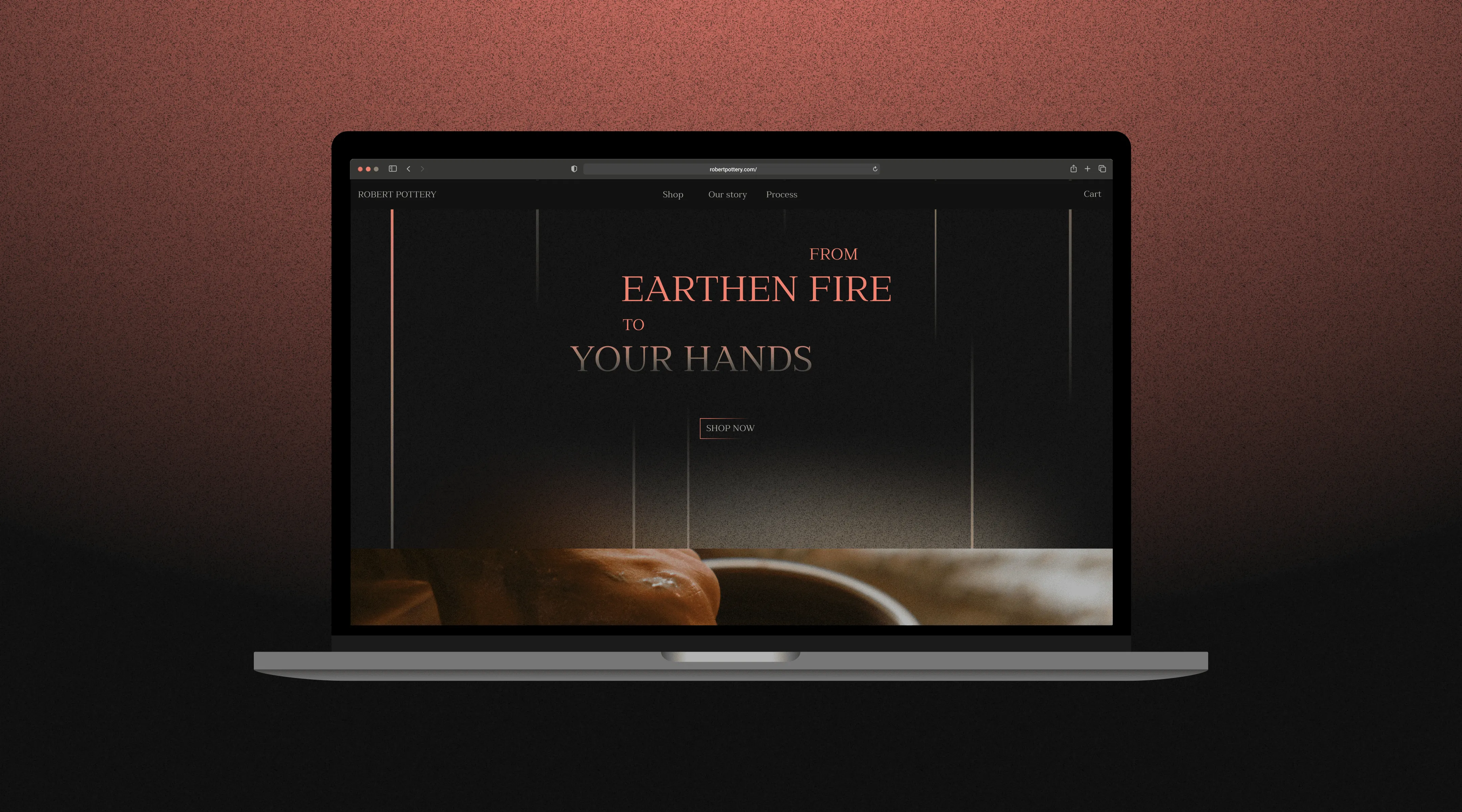

Robert's Pottery
Portfolio
Branding
E-commerce